Last-Mile Delivery, Visualized [Last-Mile & Logistics Infographic]

by
Yulia Miashkova
August 20, 2021
They say it's better to see something once than to hear about it a thousand times. In this post, we compiled our best last-mile delivery infographics that help visualize complex logistical processes.
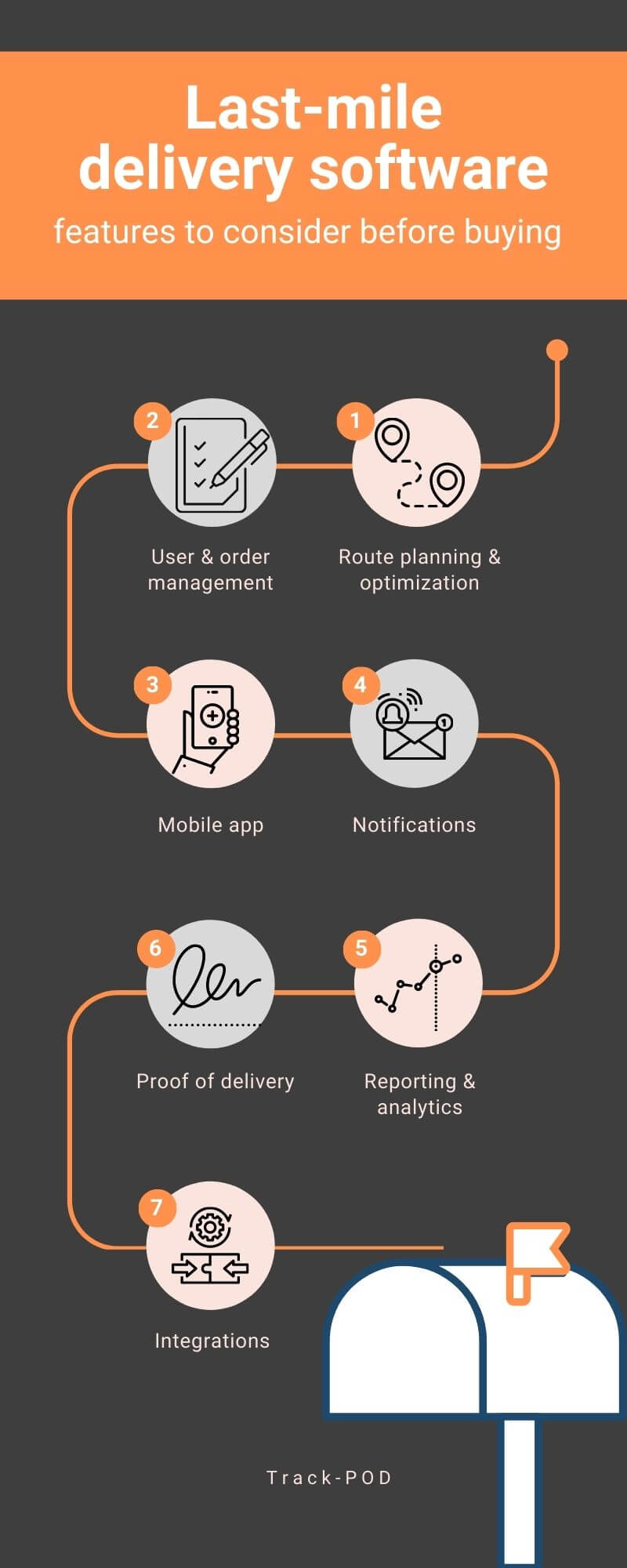
1. Last-mile delivery software
First off, we take a look at what last-mile delivery software is supposed to do to get the job done. Here are all the core features you need to look out for when choosing a last-mile delivery tool.
 To read the full article, go over to Track-POD vs Onfleet software comparison.
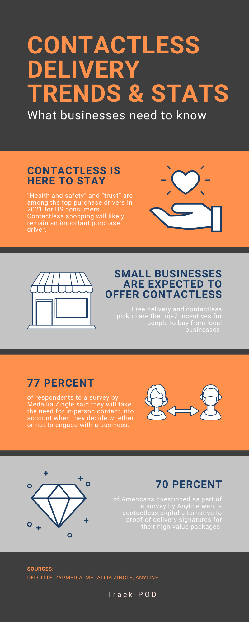
2. Contactless delivery stats
Next up is contactless delivery. How big is the demand for no-contact delivery option? Here's everything you need to know as a business that provides self-delivery.
To learn more about how you can provide no-contact delivery with Track-POD, dive into our guide to contactless delivery.
3. Carbon-neutral shipping
Carbon-neutral shipping is what the world and consumers need. Learn what delivery giants such as Amazon, DHL, UPS, FedEx, and Shopify are doing to offset their carbon footprint.
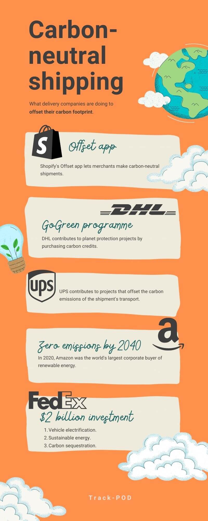 Curious to know how you can move to carbon-neutral shipping with Track-POD? Check out our case study on ZMOVE, a zero-emissions delivery business in Newcastle, or keep reading the full guide to carbon-neutral shipping.
4. Logistics manager salary
What are the best places in the world to work in logistics? We compared the logistics manager salaries across the globe to find out.
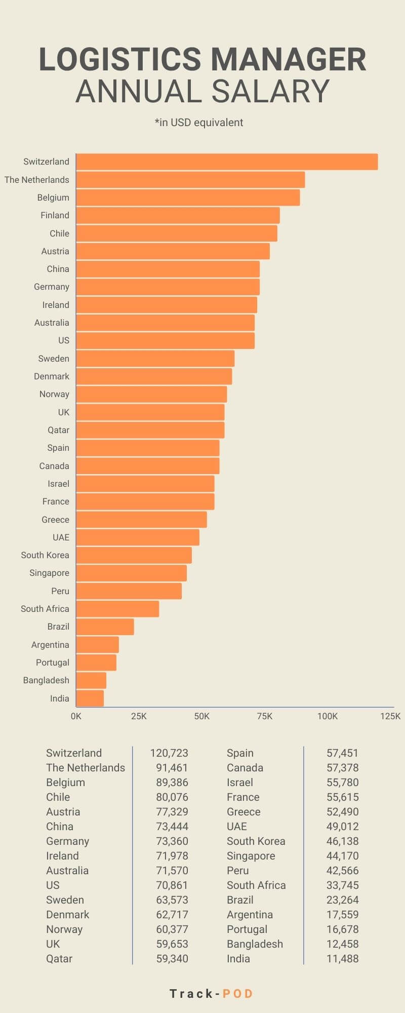 To read the full blog post, head over to the logistics manager salary story.
5. Freight logistics
Freight logistics involves a lot of moving parts. We took a closer look at how freight forwarding works to understand freight logistics better.
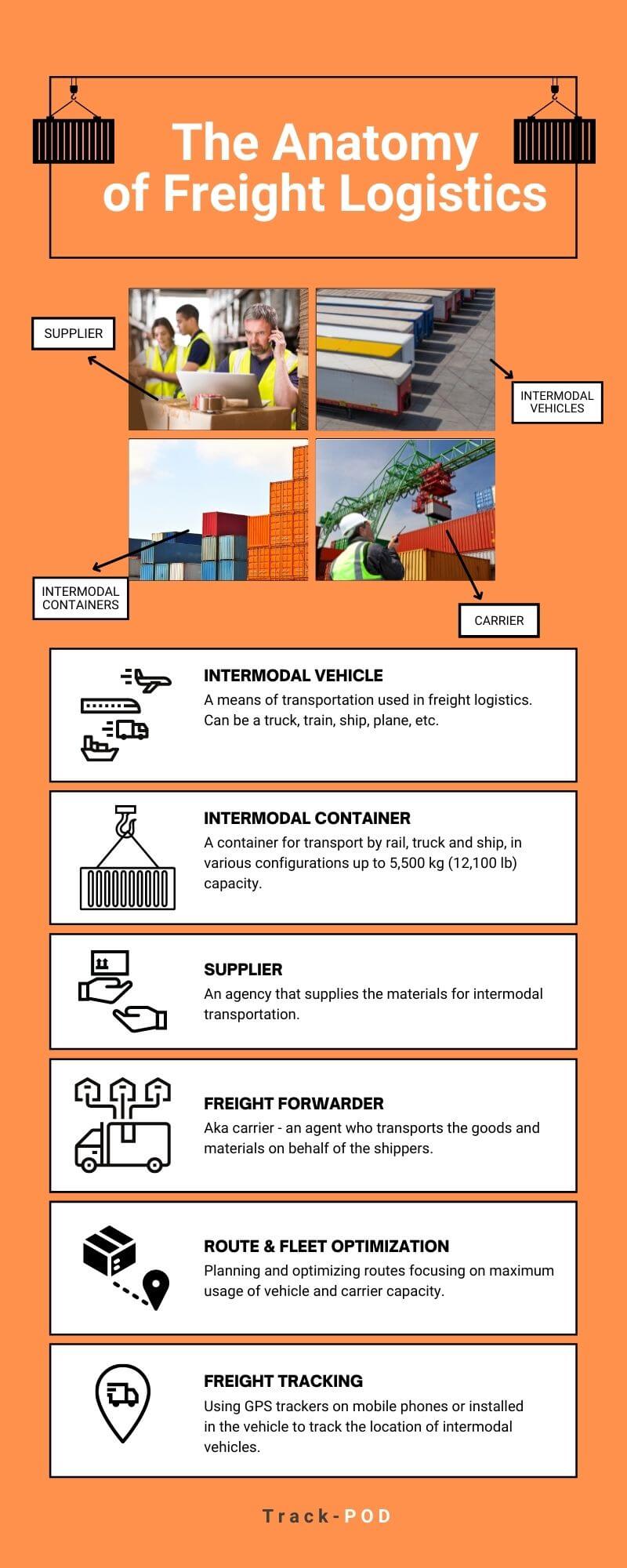 Keep reading the full blog post on the anatomy of freight logistics to get the full picture.
6. Enterprise fleet management
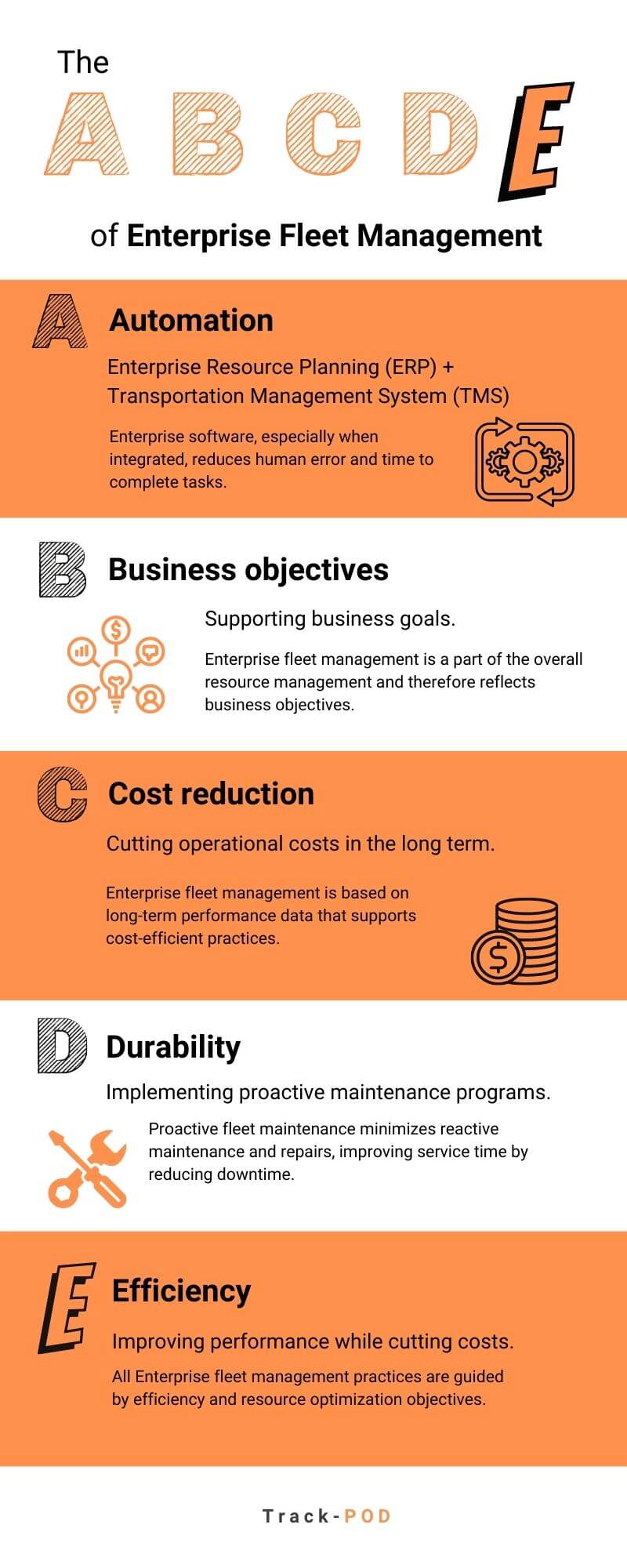
Finally, we look at fleet management in Enterprise, one letter at a time.

If you enjoy these visualizations, give this post a share. We're also happy to answer any questions you might have about the Track-POD solution during a free personalized demo.
About The Author
Yulia Miashkova
Growth marketing manager with a background in public relations, SEO, social listening, and Account-Based Marketing.


 To read the full article, go over to
 Curious to know how you can move to carbon-neutral shipping with Track-POD? Check out our case study on ZMOVE, a
  To read the full blog post, head over to the
  Keep reading the full blog post on the anatomy of