Why Your Product Packaging Matters + How to Get Yours to Sell Itself

by
Alina Kostukova
June 19, 2023
The simplest reason why packaging matters is that it keeps things safe.
Containers and wrappings keep items in pristine condition by shielding them from the elements.
Yet, in terms of your brand, product packaging is about so much more. And getting noticed by customers is only the tip of the iceberg.

Why packaging matters
How you package a product can majorly impact customer experience and perception. It even serves as an indicator of your company’s priorities.
A lot of marketing discussions nowadays focus on the virtual side of things, like strategies for email marketing, ad campaigns, and outbound sales often led by a specialized email marketing agency that helps brands refine messaging, personalize outreach, and improve engagement.
Integrating text to video AI into these strategies can enhance customer engagement by transforming textual information into compelling visual narratives.
But you shouldn’t ignore the more traditional ways of promoting your brand. Putting things out into the world, like distinctive package design.
When it comes to physical products, well-designed packaging can be a very useful part of your sales enablement toolkit. With that in mind, let’s look at some of the reasons why packaging matters so much.
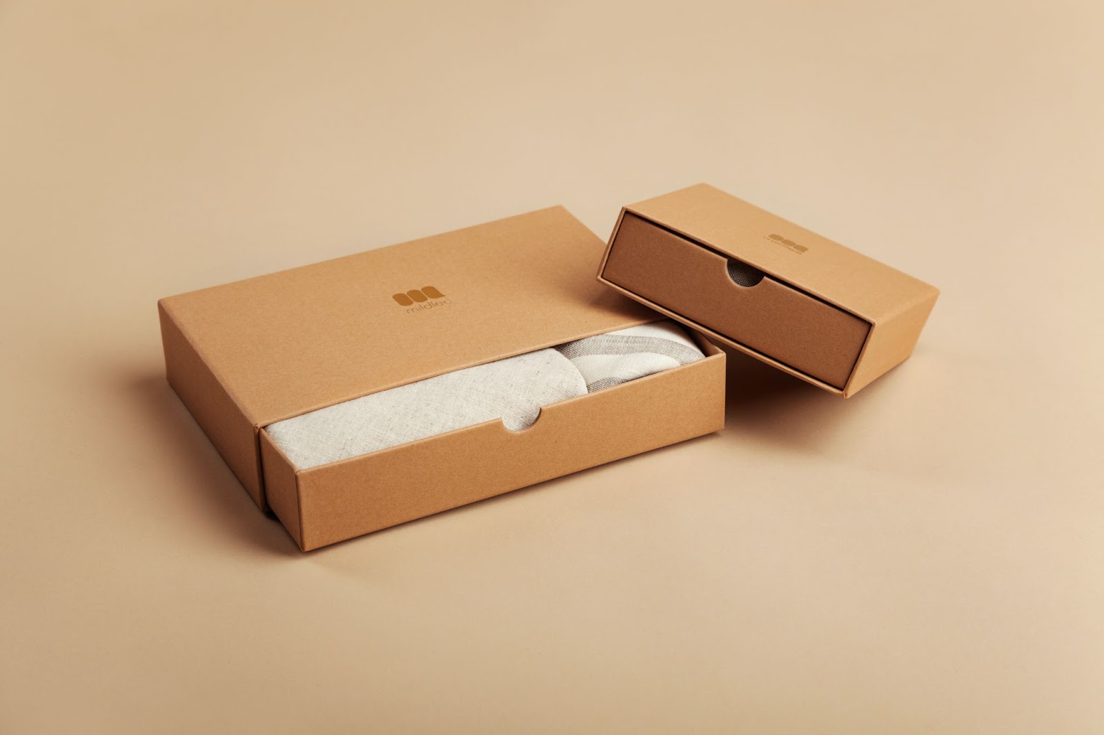
1. Good design is eye-catching
The visual elements of packaging design play a key role in purchase decisions. In fact, a study of snack food packaging from earlier this year found several key packaging elements with causal effects on purchase decisions.
The essential design elements are color, shape, image, line, and typography. Using high-quality images on your packaging can significantly enhance visual appeal and make your product more attractive to potential buyers. The studies show that color and image are the most important among those. This is because they have a causal relationship with the other design elements without being affected by them.
It’s commonly said that we shouldn’t judge a book by its cover. And yet, that’s often how we make purchase decisions when comparing equivalent products.
People tend to be drawn to the thing that stands out. Obviously, there are other factors. But this remains one of the most direct ways to attract customers.
So, it’s worth going the extra mile with packaging to get noticed. Just make sure the design is still practical. Otherwise, your flashy design might negatively impact the logistics of transportation.
2. Package design is an extension of your brand
Creating something eye-catching is only one aspect of the design process. It’s not just about it looking pretty.
The packaging also serves as a distillation of your company’s brand identity. Package design is an art form, and the whole point of art is to evoke an emotional response. And the emotional response you want purchasers to feel depends on your product and overall brand identity.
One major reason why packaging matters for your brand is recognisability. Good logo design matched with a complimentary aesthetic helps ensure people recognize a product as one of yours at a glance.
Package design can also communicate your brand values or attract a target demographic. Environmentally conscientious shoppers may be drawn to products with minimal packaging or materials made from sustainable sources.
But it’s not just about aesthetics. And your brand is (hopefully) much more than that one specific product.
Let’s say you’re a B2B organization selling comms equipment. You want customers to get the most out of their phones and switchboards because it reflects well on your business.
Informative packaging can be used to direct customers toward anything relevant and useful. For this example, you could direct customers to Dialpad VoIP services or resources providing advice on your products.

3. The right packaging enhances customer experience
It’s easy to just view packaging as something standing between a customer and their product. But another reason why packaging matters so much is that it’s arguably part of the experience too.
It’s a bit like being a kid unwrapping presents on Christmas. The excitement and anticipation are almost as good as the thing itself.
Take unboxing videos, for instance. They have become a trendy content format online. Every month, over 90,000 people search “unboxing” on YouTube. There are dozens of unboxing videos which have passed the 10 million view mark.
Even people who don’t get a kick out of these forms of video content can be enticed by the good package-opening experience. That’s the approach taken by gift box subscription services like Craft Gin Club or Loot Crate.
Making the most of your packaging
A huge part of why packaging matters is because it’s basically a blank canvas. And there are all kinds of ways you can use it to engage with customers. It’s one of the critical aspects of graphic design: Making the best use of the space you have to work with.
Provide useful info
There’s more to package design than fancy logos and nice product pictures.
Some of the best-designed packaging is informative, too. That might mean usage instructions. Or, in the case of food items, nutritional info. You can even include some fascinating facts about your company or products.
That’s far from the extent of it, however. The info you include on packaging can also be a vital part of your omnichannel customer journey map.
Packaging info can tell people about your online stores, social media, customer help channels, and more. Of course, it’s a balancing act. On the one hand, you want to inform people. But, on the other hand, you don’t just want to cover the box in ugly text.
It doesn’t even have to be a lot. Let’s say you have a new .ai domain name for your business. Even just some branded packaging tape can be enough to promote your new web address.
Less is more
There are plenty of arguments for why packaging matters. The right design can really help you make the most of your online business. But, don’t forget, having too much of a good thing is always possible.
For starters, too much packaging can be an annoyance. There’s always another pouch to open or another bit of plastic to untwist.
But that’s not the main reason you should aim for less packaging. The biggest reason is the environmental impact.
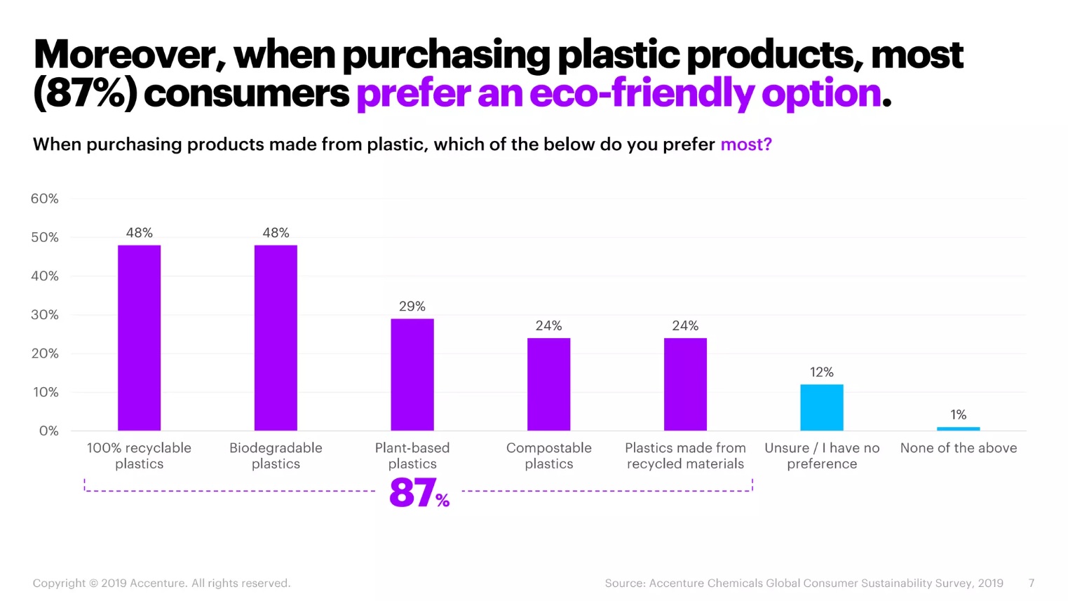
These days, your average consumer is more environmentally aware than ever. A McKinsey survey on sustainability in fashion found that more than 60% of respondents reported going out of their way to buy products with sustainable packaging.
A similar percentage considers a brand’s promotion of sustainability in some way. And 67% view the use of sustainable materials in general as an important purchasing factor.

Security versus accessibility
On the one hand, we want packaging to be robust and secure. People are less likely to buy something that looks vulnerable to damage or tampering. And some products are even hard to open by design, such as the child-proofing on medication containers.
But it’s vital to consider accessibility as well. Not everyone has the same needs or capabilities.
People with some physical health conditions may struggle with tough packaging. This can alienate them as a product-user.
It’s always important to consider who might use a product, and what you can do to make it more accessible. With that in mind, remember that accessibility doesn’t end with opening a product.
And yes, we may be talking about physical packaging. Once again, it’s about the information you can provide people. We want to reiterate its usefulness for omnichannel marketing in an increasingly tech-based marketplace.
Product packaging done right
As you can see, there’s a lot to think about in terms of why packaging matters. If you don’t get it right, customers can be put off. And the hassle doesn’t necessarily end when you finish your overall design, as there are many other elements to consider.
Like localisation differences if you’re marketing a product internationally or braille labeling for overall accessibility.
Having a QA process like Global App Testing can make a difference in helping you keep your target market in mind. So, to round things off, we wanted to highlight three businesses whose packaging sets a standard worth following.
1. Cadbury’s iconic purple packaging
Although Kraft acquired it several years ago, Cadbury’s has a long history as a British chocolate brand. The purple wrappers they use for their products help them to stand out from the crowd. There’s even a particular shade of purple they use for their products (Pantone 2685C).

Of course, Cadbury is hardly the only company people associate with a particular color scheme. Think of Netflix’s red-and-black layout. Or the “mustard theory” of McDonald’s red-and-yellow.
2. Apple’s sleek simplicity
In many ways, Apple’s packaging embodies the “less-is-more” philosophy.
A simple, clearly labeled white box topped with an image of the product inside. They could definitely choose to be flashier than they are.
However, Apple’s clean-cut packaging with an understated design connotes professionalism. And, although the packaging designs are simple, that isn’t to say they’re insubstantial. Everything is packed into its niche, making the most out of space while keeping the expensive hardware safe.

3. The simple appeal of Graze
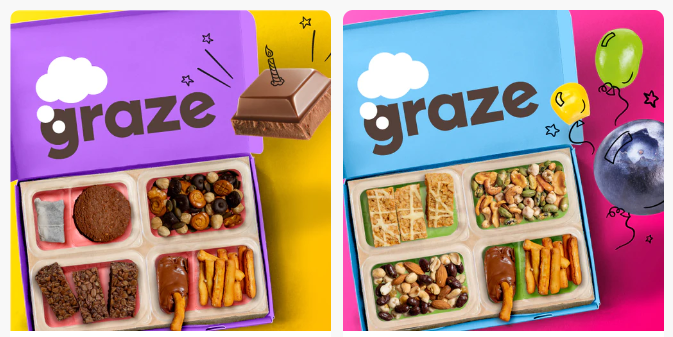
Graze is a subscription-based healthy snack delivery service. For their fee, you get periodic deliveries of different snacks each time. But what about the packaging?
They’re a great example of a company using renewable materials for a greener supply chain. As part of their down-to-earth appeal, Graze favors simple, cardboard packaging.
Graze color-codes their packaging so that they’re easy to tell apart. They even support omnichannel marketing by including a rewards system and information about their online store.

Make your choices
So, now you know why packaging matters and who to look at as examples. Creating effective packaging which stands out is easier said than done.
There are so many design choices to make, and with practically unlimited options, it can seem impossible. So, if you’re really stuck, remember these key pointers.
-
The demand for sustainable packaging is growing.
-
Your image choice and color palette should tie everything together.
-
Well-designed packaging feeds into omnichannel marketing.
-
You can make opening the product an enticing part of the customer experience.
Figuring all of this out is well worth it to put your product head-and-shoulders above the rest. The best choices depend entirely on what you’re selling, your brand values, and who you’re selling to. But once you have a unified vision for your brand identity, the rest should start falling into place.
About The Author
Alina Kostukova
Skilled marketing content creator with a background in digital media and public relations. Focused on creating first-rate text and visual content that stands out and tells compelling stories.


